Department of Archaeology, the University of Sheffield, UK. Email: a.atkin@sheffield.ac.uk
Cite this as: Atkin, A. 2015 Review of Dactyl: an Interactive 3D Osteology App [iPad], Internet Archaeology 38. https://doi.org/10.11141/ia.38.5
UK availability and pricing from Anthronomics. £16.99 on iTunes, includes 'Skeletal Anatomy Pack'. Additional packs include 'Basic Juvenile Osteology', 'Basic Fractures', 'Basic Pathologies', all at £2.29 each (Anthronomics encourages people from institutions to get in touch if they are interested in non-individual purchase options). Available on: iOS for iPad
The study of human osteology has always relied on access to real skeletal remains from collections for teaching, learning, and reference. While I am not alone in the view that nothing can replace this experience, it has long been supplemented by representational and replica materials, some two-dimensional, such as illustrations and photographs, and others three-dimensional, such as casts and, more recently, 3D digital objects. All are important aids in the study of osteology; however, some of the most exciting advances have recently been made in interactive 3D digital osteology objects.
The first interactive 3D digital osteology objects were computer-generated representations. They were often embedded in isolation in a viewer accessed via a computer. Interactivity was limited to rotating the objects, generally by clicking buttons using a mouse. These objects were typically presented as featureless, smooth textured, and coloured white.
Advances in 3D modelling and computing technology, both hardware and software, has meant that interactive 3D osteology has moved beyond these single isolated objects to entire skeletons made up of multiple objects in relation to each other, with numerous interactive options. In addition, they can now be accessed on a variety of devices, most notably as tablet apps allowing interactions with objects to take place using tactile response.
In recent years with the adoption of 3D scanning technology in osteology, such as CT, MRI, laser, and structured light scanners, these 3D digital objects are no longer limited to computer-generated representations, and now include replicas of real human skeletal remains. These can be presented with photo-realistic colours, dynamic textures, and detailed features, and as such they represent a major shift forward in interactive 3D digital osteology. Dactyl, the focus of this review, is the newest addition to this area and is the first to incorporate all of the key advances into one resource: an app that uses tactile response to interact with high-quality replica 3D digital objects.
Dactyl is the first app to be released by Anthronomics, a company founded by Dr Tim Thompson, a reader in Biological and Forensic Anthropology at Teesside University. While the app is designed to be used in isolation, there is a link to the Anthronomics website from within it.
The website gives an indication of Anthronomics' vision for the app. It is aimed primarily at teachers and lecturers as an instruction aid, by allowing the easy presentation to students of realistic examples of bones, from which they can then demonstrate specific morphological or pathological features. It is expected that the app will also be useful for students, especially as it will provide access from any location to realistic study materials (Anthronomics 2014).
With an ultimate aim to improve the teaching and study of osteology, Dactyl also states that the app is meant to be fun. The language used throughout the app and the associated website reflect this, with a friendly conversational tone and distinct lack of jargon.
The app can be found in the iPad App Store and, provided you have an account, purchasing and installing is very straightforward. The initial purchase of Dactyl costs £16.99 and the app is delivered to your iPad pre-loaded with three skeletal elements in the 'Skeletal Anatomy' pack: an innominate, lumbar vertebra, and temporal bone. There are (at the time of publication) three additional packs of bones that are available through in-app purchasing: Basic Fractures (four bones – well-healed fibula, poorly healed humerus, burned ulna, compressed vertebra); Basic Pathologies (two bones - syphilitic parietal, arthritic patella); Basic Juvenile Osteology (two bones - femur and ilium), each of which cost £2.29.
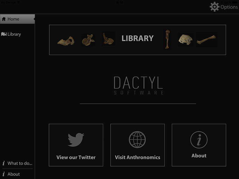
When you first open the app you are presented with a 'Home' screen. The background is black, with muted white text, which some users may find a bit dim; however, I was able to read it with no issues. On the left side of the 'Home' screen there is a menu bar with options for 'Home' and 'Library'. There are also two information sections at the bottom of this menu bar: 'What to do...' and 'About'. The main section of the 'Home' screen to the right includes: at the top, a large illustrated button for the 'Library'; in the middle, the Dactyl software logo; and at the bottom, three smaller illustrated buttons that will take you to the Anthronomics Twitter account, the Anthronomics website, and the 'About' section. There is an 'Options' button in the upper right corner of this screen, which is present throughout the app. There is some redundancy on this 'Home' screen with two buttons for accessing both the 'Library' and the 'About' page, but overall the simple design is aesthetically pleasing and easy to navigate (Figure 1).

Leaving the 'Library' section to one side for a moment, the 'What to do...' screen gives the user guidance regarding the controls of the app. It explains how to select an object and interact with it in the viewer. The app is designed to be intuitive, and individuals who have used tactile response to interact with digital 3D objects before will already be familiar with the instructions, which are becoming standardised throughout apps of this kind. One finger will rotate and spin the object, two fingers together will slide and strafe, and three fingers will adjust the angle of the lighting. It is not mentioned, but using two fingers with a 'pinch' motion will zoom in and out. If at any point you become completely disorientated, there is 'Reset' button, which will return the object to its original position in the viewer.
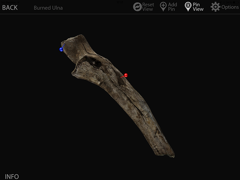
This same section also details how to adjust the settings and gain access to additional information on the bones including how the 'Pin' feature works. Users can add (different coloured) pins to any part of the object in the viewer, edit their labels and include annotations. The 'Pin View' can be toggled on and off.
The 'About' section is a brief summary description of the app and its features; however, it also states that new packs will be added to the app in the future and encourages users to contact Anthronomics if they have any suggestions for specific bones they would like included.
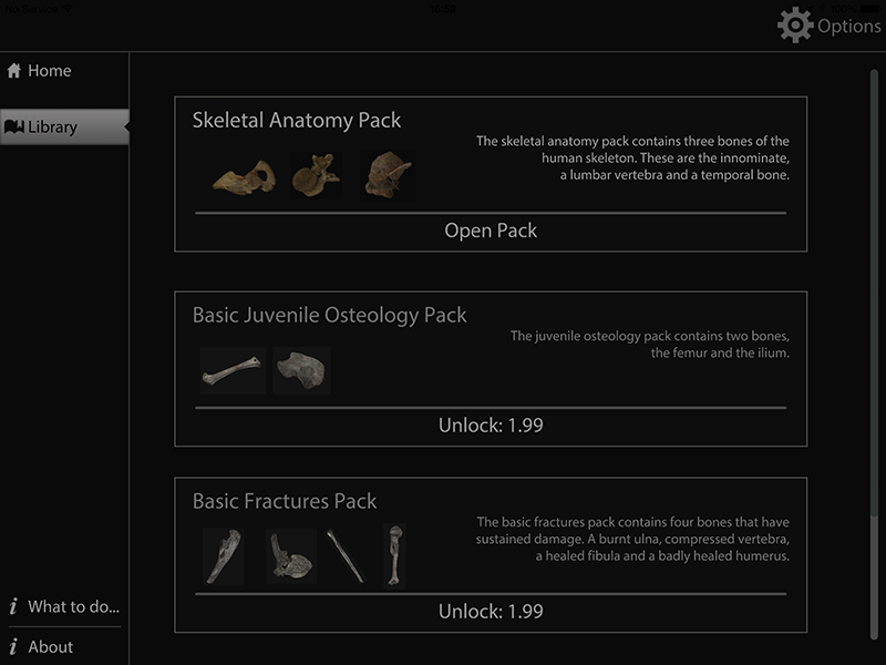
In order to view and interact with the 3D osteology objects in Dactyl, you select the 'Library' option from the 'Home' screen. The 'Library' will appear in a similar design and format and will display all of the currently available packs. The packs are presented as illustrated buttons with the title and a brief summary of what is included in each and will show if you have purchased the packs or need to unlock them (Figure 2).
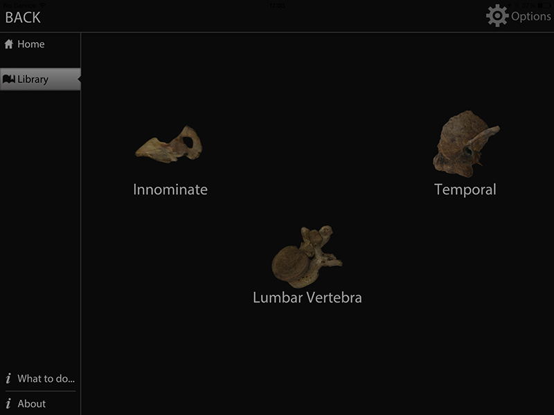
Tapping on these buttons will take you to an illustrated menu, where icons of the objects included in that particular pack are presented along with a label (e.g. 'Innominate') (Figure 3). Tapping these opens the viewer, the menu bar on the left will disappear, providing a full-screen view, and the various feature buttons will appear at the top along with a label for the object that is open.
I have accessed all of the packs currently available within Dactyl for this review. I will briefly detail my experiences of interacting with some of the objects and testing out the various features of the app.
My first impression on opening the objects in the viewer is that they are incredibly realistic. The level of detail is unlike any 3D digital osteology object I have seen and each object consistently displays this high quality. All of the features are well defined, the colours are photo-realistic, and the different textures of bone are clearly visible. It is a stunning display of the technology and definitely delivers on the statements of realism promised (Figure 4).
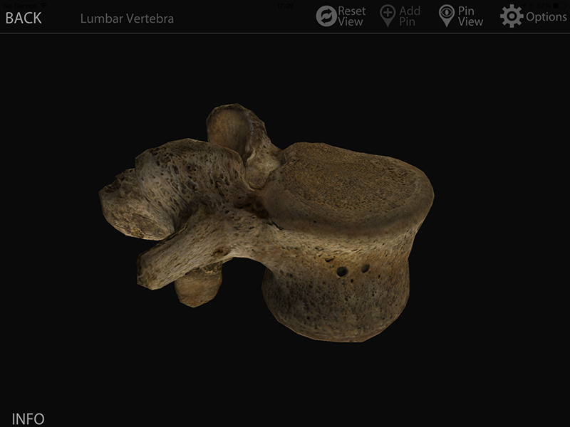
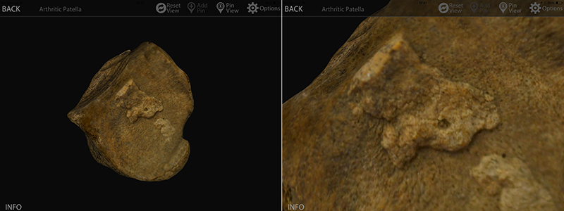
The controls are intuitive and I had no problems rotating and moving the objects to view them from all angles. The zoom function really demonstrates how clean the meshes are for these bones. There are no gaps or obvious errors - so often a problem with 3D digital objects. If you get extremely close to the surface of the object you do start to lose the definition of the colour and texture; however, it is perhaps being over-critical that these objects are not yet in HD, especially as they are some of the most detailed currently available (Figure 5). They are certainly detailed enough to identify features such as small foramina.
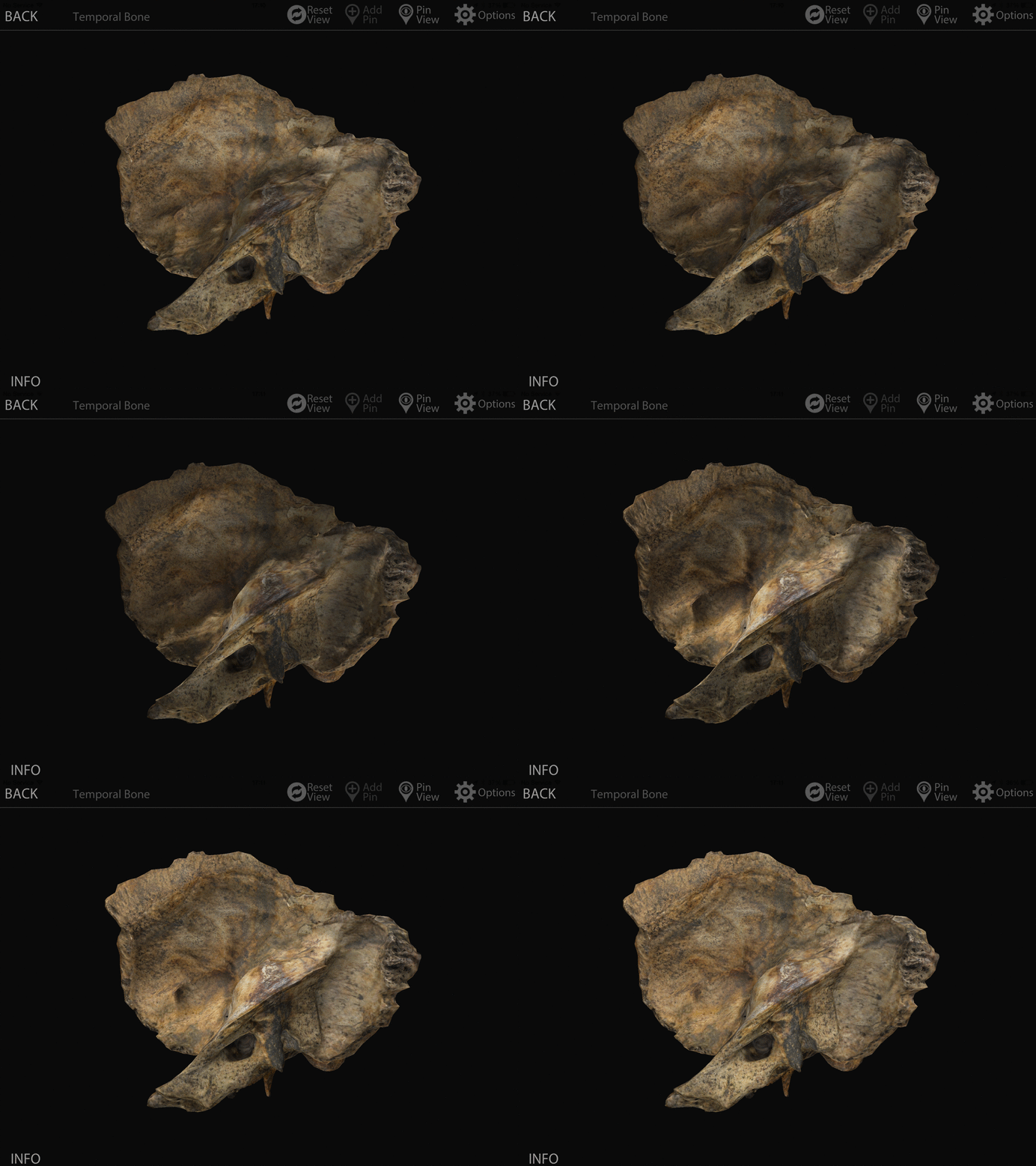
The ability to change the angle of the lighting, by swiping three fingers across the viewer is a very impressive feature. This is where Dactyl really shines, as it allows you to fully appreciate the dynamic textures across the surface of the bone. By being able to highlight specific features and areas, the objects feel more tactile even though you are interacting with them through a smooth screen (Figure 6).
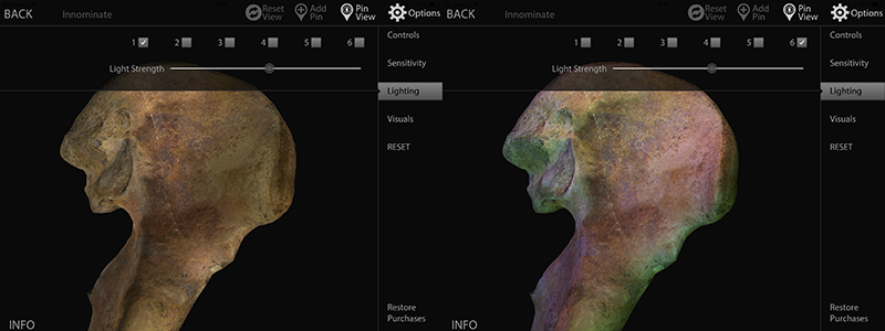
By using the 'Option' button, you can select which motion controls are available, the sensitivity of the tactile response, the lighting style and its strength, and the brightness, contrast, and gamma levels. I found the pre-selected options to be fine; however, it is nice to be able to change these to suit your individual preferences. Some of the lighting styles produced interesting effects, allowing you to investigate certain features of the bone in more detail, especially in combination with the ability to change the angle of the lighting (Figure 7).
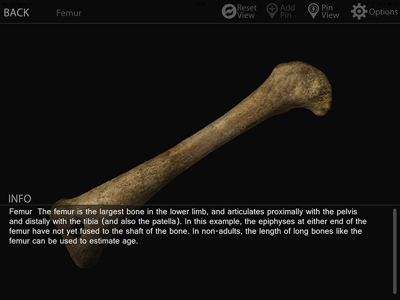
The 'Info' button in the viewer, if selected, will open a box in the lower portion of the screen. It includes a basic anatomical description of the bone and details its relationship to other bones in the skeleton (Figure 8). Occasionally, this section included details that gave the object more comparative context, such as '[this innominate] displays a youthful pubic symphysis and an iliac crest in the process of fusing', which would be helpful for students learning different assessment methods. Given that these objects are replicas of real bones, I was a little disappointed it did not mention the provenance or date of the original.
The only problem I encountered when using the viewer was with the 'Pin' feature. It was very easy to select this feature and add a new pin (Figure 9). However, occasionally on editing the title and adding an annotation the app would freeze, requiring a force close in order to continue. I contacted Anthronomics to report this bug and they got back to me very quickly saying it had been noted and would be addressed in the next update. In addition to the bug, some of the text in this feature was exceptionally small, such as confirming you wanted to delete pins.
The overall impression of the Dactyl app is one of ambition. The current leaders in interactive 3D osteology are mostly likely 3D 4 Medical's Essential Skeleton app and the Digitised Diseases project, which I feel I should mention to put Dactyl in context. Both Essential Skeleton and Digitised Diseases are free to access on the iPad, the former as an app, the latter through a browser.
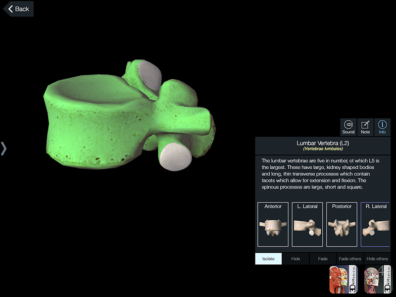
Essential Skeleton consists of multiple objects representing an entire skeleton and includes a range of interactive features and additional information (3D4Medical.com 2014). The availability of an entire skeleton in Essential Skeleton gives it a significant advantage over Dactyl, which in comparison feels incomplete. However, the objects in Essential Skeleton are computer-generated models and therefore lack the detail of those in Dactyl (Figure 10). If both of these apps included a similar number of bones, I feel the realistic nature of the objects in Dactyl would make this app more appealing to osteologists over Essential Skeleton or other similar apps.
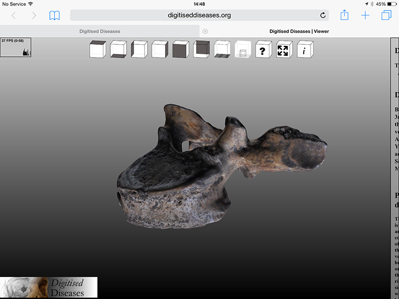
The Digitised Diseases project, from Bradford University, has certainly led the way in photo-realistic and dynamically textured 3D digital osteology objects. It consists of some 1600 objects, although not all of these are available to view online (Digitised Diseases 2014). From my own experience, the objects in Dactyl have an appearance that more closely resembles real bone as a result of their high level of detail, in comparison with those in the Digitised Disease viewer (Figure 11). While not a criticism of Digitised Diseases, its objects are limited to pathological specimens, whereas the Dactyl app includes a variety of adult and sub-adult bones both with and without pathological or traumatic lesions, although again there are significantly fewer of them. However, the biggest difference between Digitised Diseases and Dactyl is the interface. As Dactyl was purpose-designed as an app, the interaction between the user and objects is both easier and more enjoyable. The ability to determine the scale of the bones within the Digitised Diseases interface is, however, advantageous.
In its favour, Dactyl differs from all other interactive 3D osteology resources, including those mentioned above, as it is currently the only one available in which the angle of the lighting can be altered when viewing the objects, which dramatically affects how users can both view and interact with them.
With only three bones included in the purchase price of £16.99 however, the Dactyl app may be considered by many to be too expensive. This price is perhaps understandable, given the investment required by Anthronomics to develop the app and the cost of the technology to see it delivered to such a high standard. The relatively low price of the additional packs through in-app purchasing can be seen to compensate somewhat for the initial outlay. However, except for the extremely keen osteologist I am unsure whether many others will be willing to make the investment for the app in its current form, especially when there are alternatives available – despite the lower quality objects or interfaces. As a result, the pricing strategy for Dactyl is something Anthronomics may want to reconsider.
Nevertheless, I do think Dactyl is very exciting. This app demonstrates the level of sophistication that is possible in interactive 3D digital osteology. Anthronomics are upfront about the fact that Dactyl is a very new app and there are plans to expand, change, and improve the current version. There is a second version of the app already in development, due to be released in early 2015 (T. Thompson pers. comm., December 4, 2014). This newer version of the app will feature an updated interface including a new design, at least thirty additional objects available in larger packs (some of these objects may be free for individuals who have already purchased the app), and an updated 'Pin' feature. In addition to this second version of the app, there is also an Android version in development.
The currently available packs display a range of material that demonstrates the potential for future use of this app in a wide variety of areas in osteology. Of particular use is the inclusion of bones from non-adult individuals, which are often lacking in osteology resources, in addition to bones from 'specialist' subject areas (e.g. the burned ulna). Once Dactyl offers access to more objects, it will have an enormous amount of value in teaching and learning osteology and even as a digital reference collection for researchers.
With the promised update to the 'Pin' feature, this aspect of the app should be very useful. If Anthronomics considered expanding this feature to include pre-loaded pins, it would be especially helpful for students who are required to study the specific features of bones – although I accept that some students may prefer to label these features themselves as a part of the learning process.
On this note, the portability of the app is highlighted as of particular benefit to students and I can certainly see the appeal of being able to access such detailed study materials outside the confines of a laboratory. Beyond being able to 'revise in your PJs' (Anthronomics 2014) Dactyl could prove very useful for any individual who must work away from reference collections of real human skeletal remains. In these situations, alternative reference materials (e.g. textbooks) can sometimes be cumbersome or, in comparison with Dactyl, prohibitively expensive (e.g. cast materials). If you do not mind getting your iPad dirty, I do not think it would be a push to see Dactyl being used in the field. The only barrier to this portability is that currently in order to access the additional packs, even once purchased, you still need an internet connection to open them. This is something I would definitely advise Anthronomics to investigate further, as it inhibits its usefulness.
At the moment Dactyl is a very fun app to play with and has definitely made an impression with this user. I have little doubt that with the addition of more objects and further developments to the features, both those already promised and others yet to be imagined, Dactyl will become a much-used resource in osteology and other related disciplines.
3D4Medical.com 2014 Essential Skeleton 4 for iPad (website). https://itunes.apple.com/ie/app/essential-skeleton-4/id623811668?mt=8. Last accessed: 4 December 2014
Anthronomics 2014 (website). http://www.anthronomics.com. Last accessed: 4 December 2014
Digitised Diseases 2014 (website). http://www.digitiseddiseases.org/. Last accessed: 4 December 2014
Internet Archaeology content is preserved for the long term with the Archaeology Data Service. Help sustain and support open access publication by donating to our Open Access Archaeology Fund.
Internet Archaeology is an open access journal based in the Department of Archaeology, University of York. Except where otherwise noted, content from this work may be used under the terms of the Creative Commons Attribution 3.0 (CC BY) Unported licence, which permits unrestricted use, distribution, and reproduction in any medium, provided that attribution to the author(s), the title of the work, the Internet Archaeology journal and the relevant URL/DOI are given.
Terms and Conditions | Legal Statements | Privacy Policy | Cookies Policy | Citing Internet Archaeology
Internet Archaeology content is preserved for the long term with the Archaeology Data Service. Help sustain and support open access publication by donating to our Open Access Archaeology Fund.