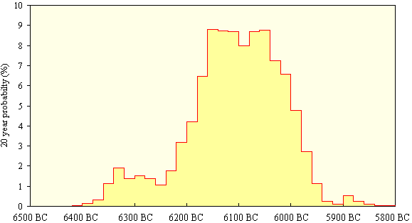
Figure 1: Radiocarbon determination OxA-1599: example of a calibrated probability distribution at 20-year intervals
When we first thought of Internet publication we had the brilliant idea that we could animate our distribution map of related sites in order to show how the sites occurred through time. That is to say: we thought that someone else would be keen to do it for us. We found our someone else in Rob Sands and he set to work to write a programme that would take in the radiocarbon dates and provide an animated map. Meanwhile Magnar Dalland worked on the dates themselves.
It was necessary to take account of the fact that individual radiocarbon determinations deal with the probability of the date falling within a certain range of time. As a further complication, we also had to take into account the fact that each of the sites in which we were interested had not one, but several determinations. Magnar therefore had to manipulate the data in order to provide one average determination for each site, as well as calculating the different probability readings throughout the time range specific to any particular site.
All of the dates were calibrated using the OxCal calibration programme and from this each date was divided into a series of four year probabilities. The resolution of the data was then reduced by combining these into 20-year intervals, and 100-year intervals at the centre of every 20-year block were calculated.

Figure 1: Radiocarbon determination OxA-1599:
example of a calibrated probability distribution at 20-year intervals
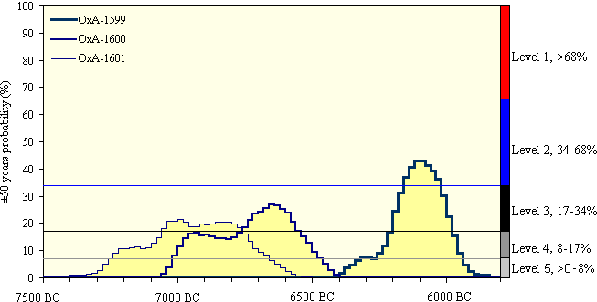
All the dates from a single site could then be plotted on to one graph and divided into five different levels of probability.

Figure 2: The five levels of probability for
the three dates from Auchareoch
The individual probability levels were each assigned a colour and thus the depiction of any one site could change colour according to the probability of its having been occupied at any one time. Sites therefore not only light up, but they also change colour. This takes some getting used to, and like any distribution map it can only reflect the archaeological work carried out, but the result (this link requires Java 1.1.5) is interesting nonetheless.
Rob was great at putting our thoughts into action, though, predictably, it was not as simple as initially imagined and a lot of hard work went into the map. In order to carry it out, Rob used the Java programming language and one of the main problems is that this field is developing so fast that the structure of the map was out of date almost as soon as it had been completed. The basic work has been done, however, and now the programme could be run on any set of data. New versions would, no doubt, be more sophisticated.
It was a slow process to make the map because we were all learning as we went along, and some elements were refined over and over again. It went ahead, however, without any real problems. Because not every one will have a browser that can support the animation, Rob also produced a static version. This can be more easily accessed and provides the same information without the time-depth variation (ie, it is a conventional distribution map). The lack of suitable browsers is a problem that should be solved in future as equipment is upgraded. In the meantime, the report includes links to sites from whence patches to upgrade a browser might be obtained.
Nevertheless, this problem highlights a more general difficulty with Internet publication: namely that authors will always be keen to take advantage of the most sophisticated software in order to show off their data, while individual readers may not wish to upgrade their equipment and programs so frequently (though the two key browsers are free and relatively easy to set up). Paper publication does not involve problems like this because the publisher, in effect, provides the browser - otherwise known as a book.
© Internet Archaeology
URL: http://intarch.ac.uk/journal/issue7/wickham/map.html
Last updated: Mon Sept 6 1999