Figure 33: The CosmoPlayer toolbar
There were many things to consider when designing the user interface. Essentially, this was to be a stand-alone electronic display for use in a museum (section 2.1). Of necessity, the interface had to be intuitive, suitable for users of different ages, easy to use by those with no technical experience, and interesting enough so that those with some knowledge of virtual reality did not feel that they were being patronised. The design of the interface was limited by the browser used to view the model, which provided pre-defined functions. This tool had to be integrated with some user information to allow any user to view the model.
The model is viewed using CosmoPlayer 2.0, which has its own set of pre-defined tools. This gives a confusing area of options for the user, and has only a basic help mechanism integrated into the system.

Figure 33: The CosmoPlayer toolbar
On the far left of the toolbar (figure 33) is the drop down viewpoint menu. The central panel holds the navigational tools required to explore the model (the user has to select a tool then click and drag to move). On the far right are the preferences and help buttons and the link to the Silicon Graphics Site indicated by the CosmoPlayer logo.
The toolbar, as well as the five primary options shown in the centre, offers another five tools by which to view the model. There is the option to use 'gravity on' or 'gravity off', various tools to navigate, and different options to control the speed and lighting of the model. To limit this greatly, and hopefully make the toolbar less confusing, as many of the advanced options as possible were disabled to provide a basic set of navigational tools; go, tilt, slide and seek. Gravity was not imposed to allow users to climb up and down the two pits and stairs in the model, and collision was turned on to stop the disorientating effect of walking through walls. Transparent screens were also erected in the model to prevent the user from accessing areas which were of no interest, such as inside the three pyramids (which had no interior decoration and so were not archaeologically sound), or inside Room D, a small repository for refreshments for the dead in the tomb (which was very difficult to get into or out, and had no real significance to the user). This hopefully made the user interface more intuitive from the outset. Unfortunately there were still some buttons that could not be disabled, such as the CosmoPlayer icon, preferences and help menu, which posed some problems during testing.
The museum wanted to incorporate three different ways of viewing the model into the package, and there needed to be some way of connecting all three (although technically all three can be combined into one it was felt that this gave too many confusing options for one user). Three basic versions were created; the animated fly-through, the model with some guided viewpoints, and a version that gave the user no help at all in navigating the model. Having these three versions also meant that it would be easy to test the average user's ability to navigate a virtual structure, and the level of help required to do so.
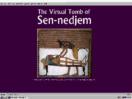
Initially a frame mechanism was set up which presented the user with an opening screen. Subsequent screens were linked to this by means of a button on the lower frame, meaning whatever version of the model was being used, the user always had the option to return to the start and try another. Also, hopefully, a new user, when confronted by a model which had been left in progress, would be able to return to the start of the package. This opening screen showed a large image featured in the tomb to attract the interest of the viewer (figure 34), and also some copyright and creation data. The large image was hyperlinked to the rest of the model. The image of Anubis preparing the mummy was used as it was felt to capture the overall function and stylistic quality of the inner chamber.

Figure 34: The opening screen to the first design of the display.
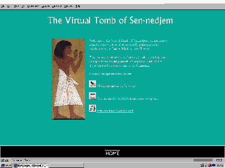
This opening screen was initially connected to a second one that gave the user a brief introduction to the tomb, and provided the three options for the user to view a model (figure 35).

Figure 35: The introductory page to the three versions of the tomb.
This uses an image of Sen-nedjem. The three buttons were created from hieroglyphs found in the frescoes in the tomb.
There were obvious problems with using three versions. They all required instructions to tell the user how to begin the animation, or use the viewpoints, or use the buttons on the toolbar to navigate. Another major problem was the time the model took to render every time a different version was loaded. The design of the system also presumes that the user is au fait with hyperlinks, the mouse, and the concept of returning 'home' to the start.
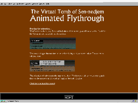
There was still the problem of giving users basic information regarding the tools. The initial version of the user interface consisted of three more screens, accessed prior to the loading of the model, which gave the user some indication of how to use the interface (figure 36). The model is activated by means of a hyperlink on each instruction page.

Figure 36: The introductory screen to the animated fly-through
This screen attempted to provide the complex instructions needed to activate the animation. There were problems with this, as described below and in the section on testing.
This version of the model was then tested to see how users navigated around the different models, and how they understood the user interface. Unfortunately, there were found to be major problems with this design, as documented in the section on testing. Although some resulted from the toolbar provided by CosmoPlayer, the frame system was found to be unsatisfactory for a variety of reasons. The fact that the model takes five minutes to render meant that the user had forgotten the often complex directions in the time elapsed since reading the instructions. Users were not prepared to wait five minutes. The frame used to allow the user to return to the start wasted valuable screen space, and users unfamiliar with multimedia did not understand that the 'home' button led back to the start. It was obvious from initial testing that this version was not a suitable end product.
There were also problems with the three different versions. It was found after testing that even the most experienced users could not manipulate the package well enough to be able to see the tomb without any assistance. The viewpoints provided were an alien concept to many, and understanding how to implement them was a problem.
Understanding how to start the animation also caused difficulties. First attempts had tried to start the animation automatically on loading, but VRML allows the user to explore the model before it is fully loaded. This meant that because of the large size of the tomb images, the animation had completed before the tomb paintings were in place. A button was added to the model to try and implement the animation from within the scene, but this could not be made to work satisfactorily. The animation, as a result, had to be triggered manually after the model was loaded, which led to another major problem common to all three versions; how did the user know when the model was fully loaded?
Several options were discussed, as explained in the conclusion in the testing section. A second stage of the design was planned as follows.
The model needs to remain fully rendered to cut down on the time wasted by each user waiting to begin using the model. Help, and the animated fly-through, need to be integrated into this version of the model. Help and instructions need to be displayed on the same screen as the model to enable the user to understand how to use the CosmoPlayer toolbar, and how to start the animated fly-through. All other options presented by the Netscape interface should be hidden to prevent the program from crashing (but unavoidable in the case of the link to the CosmoPlayer website in the CosmoPlayer toolbar which could not be disabled).
A version of the model with the animated fly-through and the viewpoints needs to be displayed in a Java window to stop any other Netscape options being visible. Information needs to be presented on the screen by a set of Java windows. On start-up, a Java pop-up window explaining how to trigger the animation will appear. During the animation there will be a voice-over that imparts information about the model. Sound will also be used to give atmosphere to the model. When the animation reaches the tomb door, another pop-up window will appear explaining the tools in the toolbar. The model needs to be able to reset itself for the next user, i.e. return to the outer view without causing the whole model to be re-rendered. This could be implemented using a Java routine after a short period of time elapsed without any user input. Animations need also to reset at this point. The Java window containing the instructions to trigger the animation will then reappear ready for the next viewer. To save the need for an introductory screen that causes the model to be rendered again, the screen saver facility on the computer could be utilised to provide an opening title page. This would mean that the user only need touch the mouse and the model would be apparent, and reset to its initial position. This should mean that the museum need only start the model once and it should function securely for the whole day. Java pop-up windows could also be used to impart some information about the model should the museum require this. An associated database could be built to hold information about the images and this could be accessed whenever the tomb images are clicked, returning information about the wall paintings.
Unfortunately, there was not time to implement this version and carry out the required testing before the submission of the project, but it was hoped that this would solve a lot of the practical problems associated with the user interface. Documentation of the system specification and functional requirements regarding this system can be seen in section 4.
© Internet Archaeology
URL: http://intarch.ac.uk/journal/issue7/terras/user.htm
Last updated: Mon Nov 29 1999