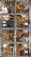
Figure 19: The composite roof image.
All images are taken from the art historical publication which contains a comprehensive photo documentation of the tomb of Sen-nedjem (Shedid 1994). The images are scaled down to appear in this article : the original images are much larger. All images were colour adjusted and had a Gamma tone curve applied to even out areas of light and dark. Any shaded parts highlight areas where some reconstruction of the image took place. Click on the thumbnails to view a larger image.

Figure 19: The composite roof image.
Figure 19 shows the areas of archaeological inconsistency which have been blocked out in grey. These areas are for the most part hieroglyphs which were not photographed when the main panels were recorded. The missing hieroglyphs were replaced by copies of other hieroglyphs from the roof. There was also a lot of adjustments to be done along the edges of the main panels as there were some missing parts in the photographs. However, the main panels are generally as shown. No attempt was made to adjust areas where the plaster is crumbling.
The right wall (figure 20) is shown as a quadrilateral to aid the texture mapping process. The greyed out area above the curve was filled with the background texture from the rest of the painting. Only the edge of this is seen in the tomb. Areas down each side were cropped by the photographer and so have been shown to be strictly incorrect.
The left wall (figure 21) shows the area above the curve as added. This too was the background texture.
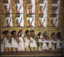
Figure 22: The lower right wall
Figure 22 was not adjusted (save for being lightened). However, the photographer had cropped over four inches of painting from the right of the picture.
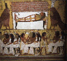
Figure 23: The lower left wall
Figure 23 was not adjusted (save being lightened) but again the photographer had cropped a large section, this time on the left of the image. The right-hand side remains very dark because of the poor lighting.
The composite image that is figure 24 posed the most problems in the tomb. All grey areas had not been photographed and had to be reconstructed using hieroglyphs from other parts of the tomb. The boxed area had been photographed in three different sections (with different scales, angles of view and lighting) which were painstakingly mapped together to reconstruct the panel as it is. Even with tone adjustment, the far right of the image remains very dark.
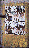
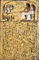
Figures 25 and 26: Door to tomb: front and back (l-r)
Figures 25 and 26 of the outer door of the tomb did not have to be adjusted from the originals.
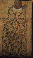
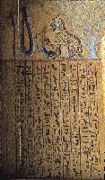
Figure 27a/27b (l-r): Inner doorway: left and right panels
Figure 27 (a and b), the panels of the inner doorway, required much work. The only photographs of these panels were taken at very oblique angles. The upper images had to be reconstructed, and the majority of the hieroglyphs copied from other parts of the tomb.
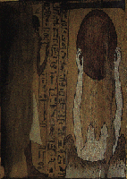
Figure 28: Inner doorway: upper panel
Figure 28, the upper panel of the inner doorway, had to be reconstructed for the model from a very oblique photograph. The left of the panel shows deterioration where the door has brushed against the roof.
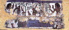


Figures 29, 30 and 31 (l-r): The lintel of the outer doorway, and outer left and right side of the doorway.
Figures 29-31, photographs of the outer doorway, did not have to be adjusted to be used in the model.
© Internet Archaeology
URL: http://intarch.ac.uk/journal/issue7/terras/improb.htm
Last updated: Mon Nov 29 1999